
Monochrome Minimalism: Why Black and White Works So Well in Architectural Photography
The first photography was black and white.
The first photograph (as far as we can tell), was "View from the Window at Le Gras", created by French inventor Nicéphore Niépce between 1826 and 1827, showing buildings in the foreground.

Buildings lend themselves well to black and white photography because of their solidity (or in some cases, transparency!). The tones, clean lines, and opacities filtered down to pure light and shade, without colour to distract.
As with the photos below, B&W also allows room for more severe light and dark within the photo, using it to display the form of the architecture. Conversely, much of the colour photography on trend at the moment avoids harsh contrast, in favour of a lower dynamic range with virtually no ‘pure black’ tones

Midland Metropolitan University Hospital, HKS Architects, Cagni Williams and Sonneman Toon. Drone photo. 2024

East Bank, Queen Elizabeth Olympic Park. 2024
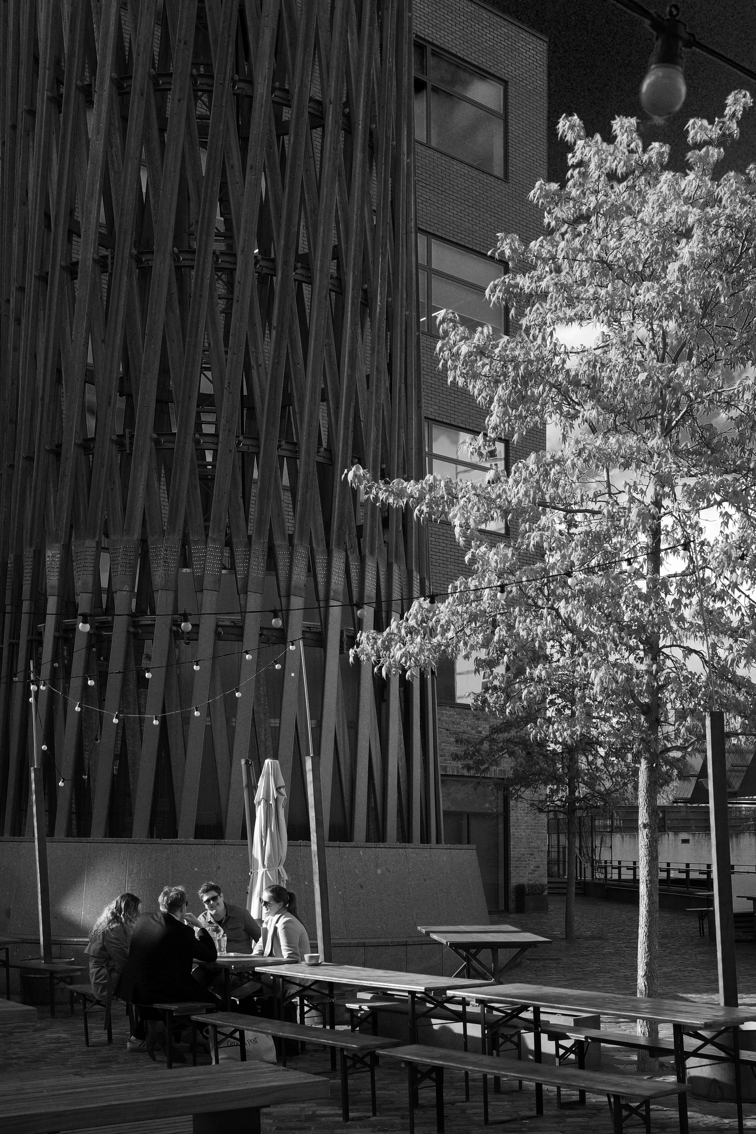
Sugar House Island. 2024
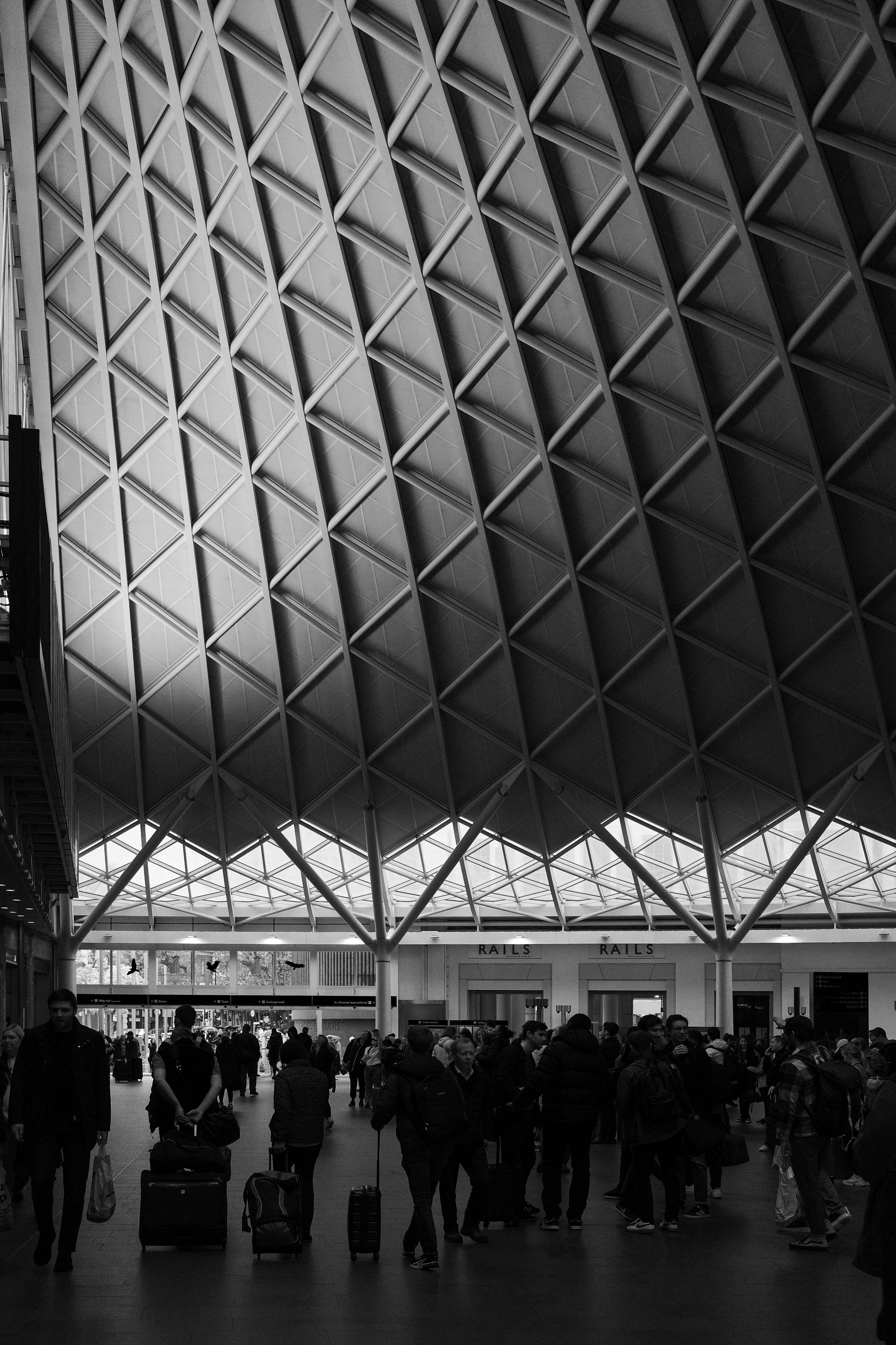
Kings Cross Station, John McAslan+Partners. 2023
Who Uses Black and White photos?
Helénè Binet is a renowned architectural photographer, who frequently works in black and white film. She believes that this allows her to better convey the essence of a building more effectively, as the architect intended. She has travelled the world to photograph historic and contemporary buildings, as well as projects in the making. Considered “the architect’s photographer” by many, Binet has worked closely with Zaha Hadid RA, Daniel Libeskind Hon RA and Peter Zumthor Hon RA among others, who have turned to her to interpret their work.
Binet largely eschews digital techniques; “It’s like being a musician in front a big audience. You can’t get it wrong. In that instant, you have to be the best of yourself, you bring your mind to a place, not to lose that unique moment.” She explains her commitment to working with the venerable techniques of analogue, as opposed to digital, photography, of carrying around heavy equipment, loading it with expensive film, of putting her head under the dark cloth at the back of a large-format camera, of composing the photograph with the upside-down image it offers on its glass screen and then developing and printing the results in a dark room.
Echoing my sentiments on pushing the shadows more in B&W, Binet has said previously that “you can hear more in the darkness”.

A detail of Zaha Hadid’s MAXXI - Museo Nazionale delle Arti del XXI Secolo, Rome, Italy, 2009 Photograph: © Hélène Binet
When should I use black and white?
Fine art photographers sometimes prefer this type of photography because it has a tendency to distance the subject matter from reality. We all see the world in colour but when it is removed, we tend to pause and look more closely.
Black and white photography further highlights shape, form and pattern in the image. When color is removed, the distractions that come with it are also done away with. This allows you to really see what is important.
You can clearly see the elements of the photo within the frame in terms of their shape, form and their unspoken relationships.
You can also make better use of negative space within the frame. Negative space is defined as the areas of the frame/photo that are empty. These are easier to highlight when shooting in black and white; as shown in Maxxi, above, where the blue sky has been turned black, framing the building.
So, Is it always best to use?
While certainly true of grand buildings by the likes of Zumthor and Hadid, this approach may fall down when representing more modest projects, where the intended audience is potential clients, and journals or magazines.
For the majority of my commercial work, I still work in colour, as the colour, materials, and feeling experienced in a space is of paramount importance when describing it. Binet has also herself softened into colour at certain points, stating “I am using colour more now and reaching for where colour can be controlled."
Black and white is often a more artistic choice for buildings, though it depends hugely on the client if they want artistic representations of their projects.
I also firmly believe that while buildings can and should be ‘beautiful’ (challenging, subjective term that it is), that beauty should be secondary to utility, and how people integrate into the spaces and make them their own. Colour is perhaps better suited to this, to relate to how we experience the buildings themselves, rather than just as shells.
What are you waiting for?
It’s definitely a technique to try out (many photographers do early in their interest in the topic; many more of mine were in B&W around 2010 than today. Having only form, not colour can change how we view things and what is of interest. On some modern cameras, such as my Ricoh GRiiix, there are B&W filters in-built that you can quickly flick on, which gives a real versatility and variance to it as a tool to capture the world. The photo below was shot with the Ricoh Hard B&W effect, mimicking the analog sky in Binet’s.
Sunny days will give a very stark effect of that below, while a cloudier day can have dramatic clouds framing the buildings, contrasting the structure of manmade architecture to the organic abstractions of clouds.
Get out there and give it a go!